Wednesday, 20 October 2010

Tuesday, 19 October 2010
My final desktop design

This is the first desktop design before any improvments were made.
After six weeks of using photoshop, drawing and taking images I have finally finished my desktop design. I have made use of the skills I have learned by using the magic wand tool by changing the tolerance settings and I was able to change the brush type to make the water effect and I used the flilter tool to change the appreance of images I made.
I like my design I think it is intresting and I also think that every thing has been put in a suitable place so the design does not look crowded and there is plenty of space for the icons to be spread out.

This is the desktop design after any improvments were given to me by the peer group.
Saturday, 16 October 2010
Unit 19 desktop Research

I am rating this a 8/10 because it leaves a lot of space for the icons and the writing is legible in front of the background. The background image is artistic and at some parts look like some are buildings in brown and the multi colour really stands out from the brown making it interesting to look at. The Shipley college logo is noticeable but not the first thing you instantly look at which is good.
However it did not make a 9/10 because the image although artistic just looks like a bunch of shapes put together for a lot of the picture and I think that the font that is used for the words Media Suite don’t really connect to the image.
I may use the artistic style by using a variety of colours to make the background pleasing to the eye so it does not look boring.

I think that this background is ok because the 38 icons are clearly presented and the background is interesting because I like how the water around the whale’s tail looks and how the Icons don’t cover the image and how the gadgets in the gadget bar are in a line so they don’t take over the whole screen.
I may use the use of how the water looks when the water is in the air which makes it interesting and makes me focus on the whales fin instead of the water.

http://onemansblog.com/wp-content/uploads/2008/04/cracked-screen-desktop-wallpaper.jpg

This is a good background because the black crack looks interesting and is different to the other 2 but like the second one the icons need to be at the left side so they don’t obstruct the main design but other than the position of the icons.
I may use the 3d effect that is presented with the crack and the way it can be seen with aink spot so two images can be seen in one image.

I got this design from http://www.filebuzz.com/software_screenshot/full/19260-AD_Silent_Lagoon___Animated_Desktop_Wallpaper.jpg

This desktop background does not show any Icons but if it did the icons would be at the left side because it is more suitable than having it over the river which to me it is the best part of the background and the task bar will not ruin the image at all.
I may use the lighting effect that this background is using.
Wednesday, 13 October 2010
My first car

This is my car I have used all the skills I have previouly learned and I also usd the material tool to coluor the car with diffrent coluors and turned the opacity down for the window. To make this car I used standard primatives like cyininders and a box to create the car I also changed the edges to make it a bit more rounder and smoother.
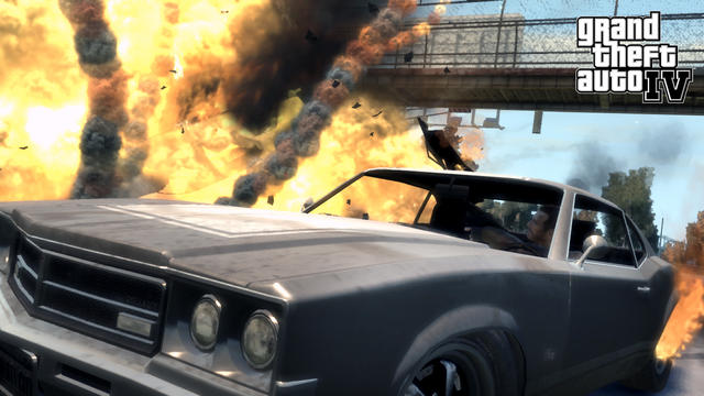
This is a proffesonal car that was made from Rockstar this can my car is slightly simalar with the curved edges however there is more deatail on this car such as the glass effect on the lights and the door handles and ther mirrors on the side.
This is a proffesonal car that was made from Rockstar this can my car is slightly simalar with the curved edges however there is more deatail on this car such as the glass effect on the lights and the door handles and ther mirrors on the side.
Thursday, 7 October 2010
PSD what makes a logo good

The Nike logo is different from the WWF logo as it has writing and the image is just a tick so some one that may have not heard of Nike and if they just saw the logo they would not understand what it is about unless they looked on the logo on some branded clothes.
The Mrozzia firefox logo is harder to understand as the firstime I looked at it I did not know why the program was called Mrozzia firefox now though I can see the orange fox but I still don't know what the blue bit is.
The top three things that make a logo suitable are:
1) Clear image
2) Keep a color shceme to make the logo presentable
3) If there is text make the font fit with the image
Tuesday, 5 October 2010
Examples of fonts

I was not able to add the fonts on to the word document so I only put the name of the fonts. The website that I used to get the fonts is www.dafont.com.
The first font may be used for the words media suite because it looks like it has been scribbled on which relates to the media suite because there is a lot of drawing in media. However the Bagpack font may also work for the media suite sign because looks like it will be more interesting and with the effects that are with it it will only need to put it with the right colour.
I will use whypo for the words Shipley college because I think that the words have a 3d effect and the letters to me look a little like the ransom letters in movies but also looks ok with the Shipley college logo.
The rest of the fonts will be used for the six words although at the moment I am not completely sure how I will use the fonts I may use all of the fonts left by having one font for one of the six words or I may just use the best font I have. If that were the case I would probably use the font all over again because it looks like the most suitable font to use for the words to look like they are being sucked in to the spiral because the lines that surround each letter to give it a static effect which to me it looks suitable when I am planning to make the words look like the letters are being sucked into the spiral.
Monday, 4 October 2010
my paper desktop design

The first design (top left) is a lot of clouds with a Jetsons theme car and I put some flying people in there to add a fantasy theme in to the desktop the icons are on the left side do they don't obstruct the design although the writing colour may need to be changed.
The second design (top right) has a blue spiral that I am using to make the words get sucked in to it like the blue spiral is a vortex. I have also put the two people I got from google images and they are standing to the left and the icons are in the middle however at first I wanted to make it look like the icons were being sucked in to the vortex but then I thought that it might confuse people and make it harder to find the programs that they are looking for.
The third design (bottom left) I wanted to make a tunnel and have things falling in to it like the Minotaur falling in the tunnel and I have the words falling through the tunnel and the icons would be falling in the tunnel as well but again i am not too sure weather it will be easy for the person using the desktop on there computer.
The fourth design (bottom right) is a different version of the second design instead of the people I have the Minotaur which maybe a bit to far from a part of the target audience and the letters are coming oust of the spiral instead of going into the spiral.
Subscribe to:
Posts (Atom)