I am rating this a 8/10 because it leaves a lot of space for the icons and the writing is legible in front of the background. The background image is artistic and at some parts look like some are buildings in brown and the multi colour really stands out from the brown making it interesting to look at. The Shipley college logo is noticeable but not the first thing you instantly look at which is good.
However it did not make a 9/10 because the image although artistic just looks like a bunch of shapes put together for a lot of the picture and I think that the font that is used for the words Media Suite don’t really connect to the image.
I may use the artistic style by using a variety of colours to make the background pleasing to the eye so it does not look boring.
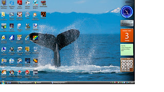
I got this background from my computer. It has 38 icons, a start button, a task bar, a information bar and a gadget bar.I think that this background is ok because the 38 icons are clearly presented and the background is interesting because I like how the water around the whale’s tail looks and how the Icons don’t cover the image and how the gadgets in the gadget bar are in a line so they don’t take over the whole screen.
I may use the use of how the water looks when the water is in the air which makes it interesting and makes me focus on the whales fin instead of the water.
I got this desktop design from
http://onemansblog.com/wp-content/uploads/2008/04/cracked-screen-desktop-wallpaper.jpg
This is a good background because the black crack looks interesting and is different to the other 2 but like the second one the icons need to be at the left side so they don’t obstruct the main design but other than the position of the icons.
I may use the 3d effect that is presented with the crack and the way it can be seen with aink spot so two images can be seen in one image.

I got this design from http://www.filebuzz.com/software_screenshot/full/19260-AD_Silent_Lagoon___Animated_Desktop_Wallpaper.jpg
This desktop background does not show any Icons but if it did the icons would be at the left side because it is more suitable than having it over the river which to me it is the best part of the background and the task bar will not ruin the image at all.
I may use the lighting effect that this background is using.


No comments:
Post a Comment